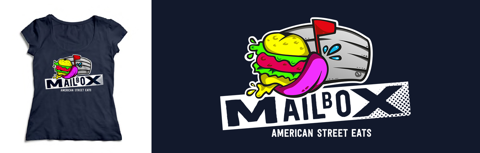
At the same time as our work on Barbel, we worked with another Newcastle based fast-food start-up. Mailbox already had a clear vision, wanting to sell American fast food around the UK’s summer music festivals and the North East’s food events.
Our mission was simple: Make a logo to match.
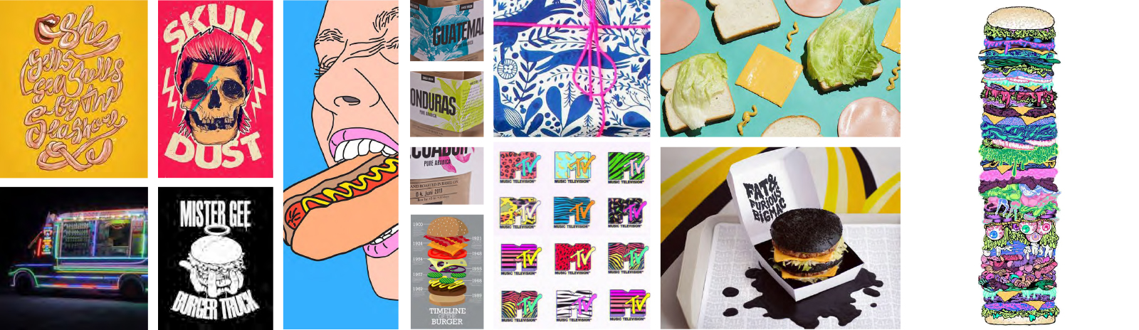
We worked with the client to discuss what would set their brand apart in the growing mobile fast-food market; a bold personality, striking exterior, and some seriously delicious American street eats. To match these qualities we developed a set of moodboards that would be our inspiration during the logo design phase. We started by collecting inspiration that would set the tone of the Mailbox logo – a bold, striking and colorful visual style emerged.
Junior Designer, Linda Hjortland Carlsen, who led the project said:
We love to get concepts like this from our clients! Any challenge where we can cut loose our creativity and do something like Mailbox and be a bit crazy is always fun. This was a golden opportunity to do something different and we really enjoyed this project from start to finish.
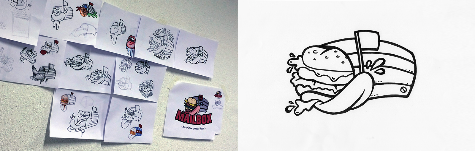
With a bold, striking, and colourful visual style agreed, we started sketching on paper before we continued the development on screen. By doing this we got softer and more realistic lines to the logo as we wanted it to have a cartoon look and feel.
You can see the final outcome below. The fun and bright neon logo suits the client’s vision, and ensures the brand will be highly visible wherever it goes. Keep an eye out for Mailbox on the street!