As designers, it’s great to always share what we’re looking at for inspiration in the design world. I thought I would pull together some of our favourite pieces of design that we’ve spotted recently.
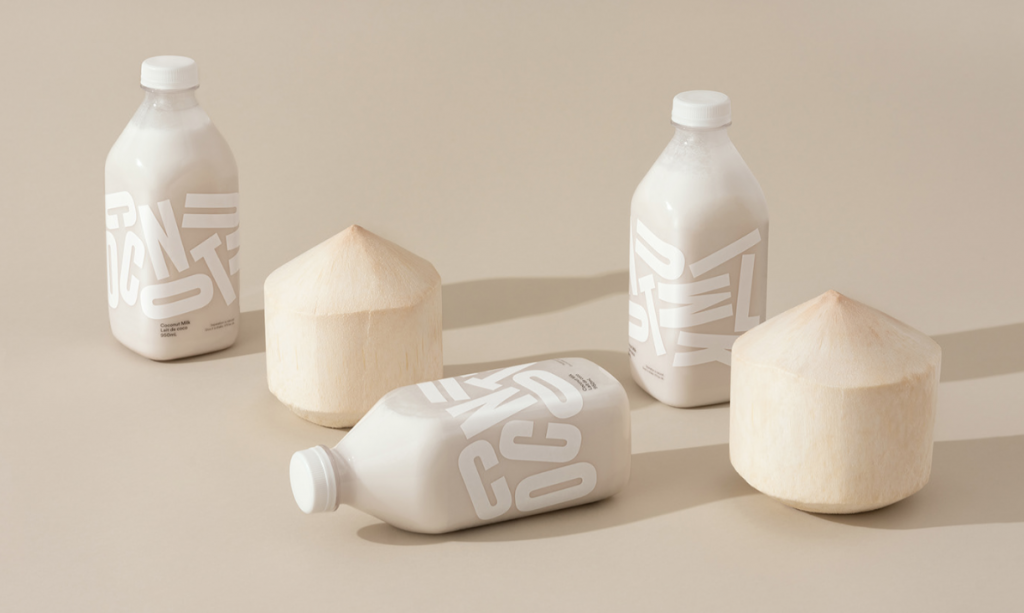
Grinning Face Coconut Milk
Neat little idea for Grinning Face Coconut Milk. This coconut milk is made purely of coconut and water, therefore needs shaking before you drink it.
Man Wai Wong created a playful typographic response for the packaging that reflects the product – jumbled up type has been used to educate and encourage the consumer to shake it.
Read more about this project here.
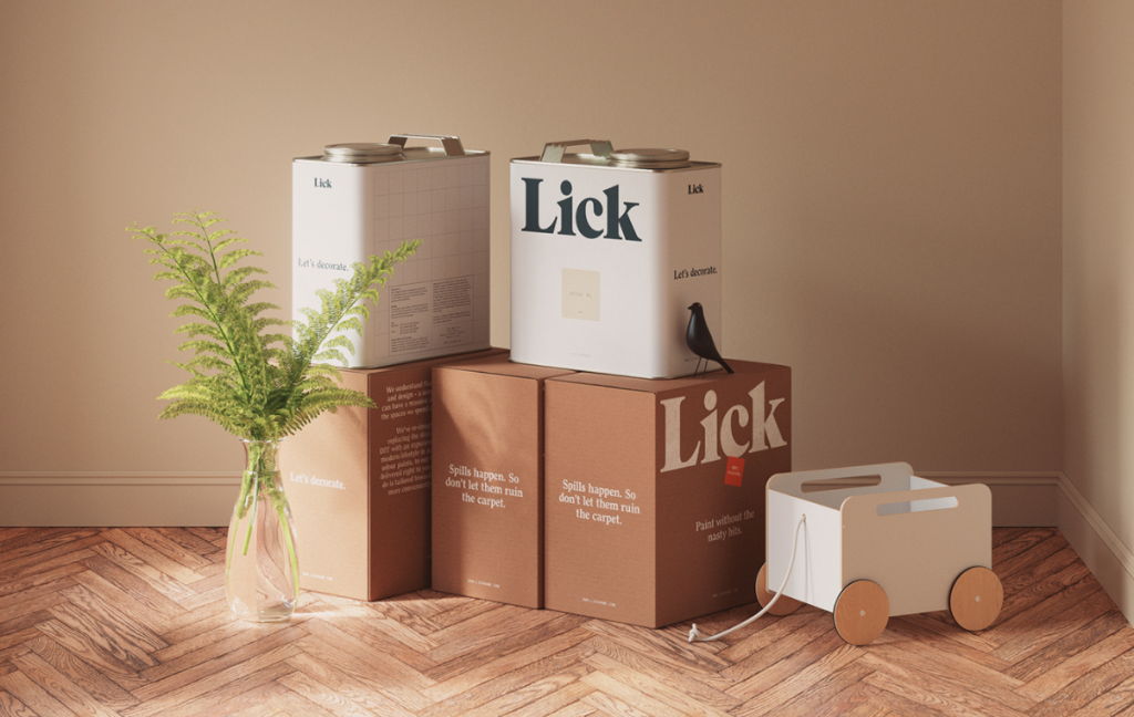
Lick Logo and Identity
As we all know, your brand is not just how you look, it’s how you act, how you speak, how people perceive you and how people feel about you.
Tone of voice is a major part in this whole picture and brands often bypass it. This new home decor brand Lick Home has a brilliantly witty tone of voice paired with their craft like and bold identity created by Two Times Elliott.
Take a look at their case study and see if the tone of voice sticks with you here.
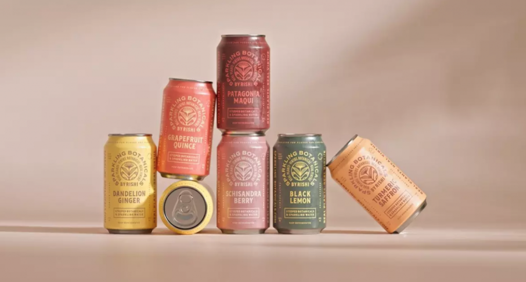
Sparkling Botanicals
I’ve always been a lover of monochromatic colour palettes – for those who aren’t sure of this terminology, a monochromatic palette is one of which all of the colours in the palette are from a single hue, using shades, tones and tints.
These sparkling water can designs show exactly why I love them so much! A gorgeous set of botanical and vintage style designs by Studio MPLS! Love them!!
Read more about this project here.
Keep up-to-date with what we’re looking at by following our regular posts on Linkedin.