You may have read a couple of my previous posts sharing inspiration that we look at day to day to stay inspired and up to date with design trends.
In my previous job, I was a lecturer at a private design college and a big part of my role was to create an inspirational environment for the students to thrive and grow off. I especially loved this part of the role and have decided to keep inspiring people around me via my Linkedin.
I’ve summarised some of the best pieces of inspiration from the past few weeks below:
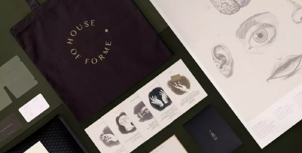
Self Promotion by House of Forme.
I always love seeing what self promotion other design agencies are doing. Love this from House of Forme in Hong Kong – they have created a ‘brand activation package’ that includes a handwritten note from the Founder, a brand Anatomy poster, mask holder, tote bag as well as an envelope with beautifully illustrated cards that introduces House of Forme’s service offerings.
As designers, we are communicators, and House of Forme felt that they needed to work on their own branding to show off how well they can communicate for others.
I think this really shows off how beautifully crafted their work is and how much time and effort they put into design!

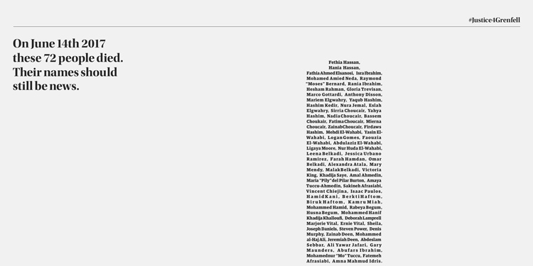
BBH London uses design to make the public think about the Grenfell Tower tragedy.
Sunday 14th June marked 3 years since the Grenfell Tower fire that tragically took the lives of 72 victims.
Creative agency BBH London aims to get the victims names back onto the news by asking news organisations to donate column inches to display a typographic design commemorating those who were killed.
We forget how much we can do with design and how such a simple idea can be used for such a great cause. I love what BBH have done here.

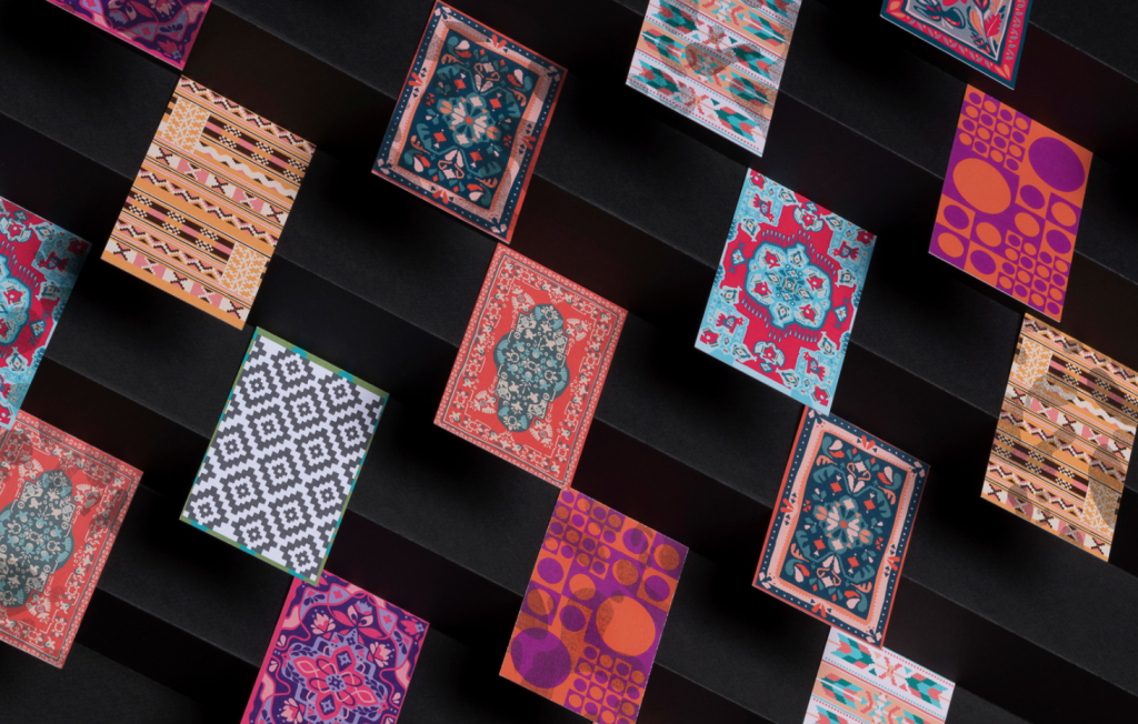
Magical themed rebrand for a carpet cleaning company by Phantom.
Carpet cleaning company “Neraida”, (which means fairy in greek) has undergone a rebrand that’s based around a ‘magical’ theme, mimicking the magic of cleaning. The busy, colourful patterns contrast against the clean, sharp typography, and the business cards were designed to have a heat-activated ink in random patterns representing stains on the carpets. You can rub the business cards slightly to magically rub off the stains.
I love how this idea is so memorable and reinforces the whole brand identity concept.

If you’d like to stay in the loop with regular design inspiration, connect with me on Linkedin.
