Opal

Rebranding an established IT business to support its present and prepare for its future.
Who
OPAL
What
Brand Audience and Position, Brand Identity, Website, Print, Exhibition
Where
North East England
Why

Staying at the forefront of the evolving  IT landscape

Established in 2008, OPAL has a proven track record for being the go to experts in supporting businesses for cloud infrastructure IT solutions worldwide. They have worked some of the most well-known businesses in the UK, along with clients in Europe, Asia and the USA. Andrew and Michael knew that the time was right to clarify the position of the business and its audiences, and ensure that OPAL’s brand was as relevant for the future as it had been in the past.

Do you like this project?

Get in touch and we can chat about what we could do for you.
The Opportunity
Clarify the audience and position to ensure the brand reflects the goals of the business.
The rebrand would provide a strong message to clients, both current and prospective, the message being that the business was focussed on the future and is as relevant as it always had been. It would also support the staff and deliver more confidence throughout the business.

We worked with the senior team to ensure that the rebrand evolved from the previous look and feel, whilst maximising the opportunity to change.
The Solution
A clean and fresh identity that reflects the fluidity of IT needs, whilst retaining a structured core.
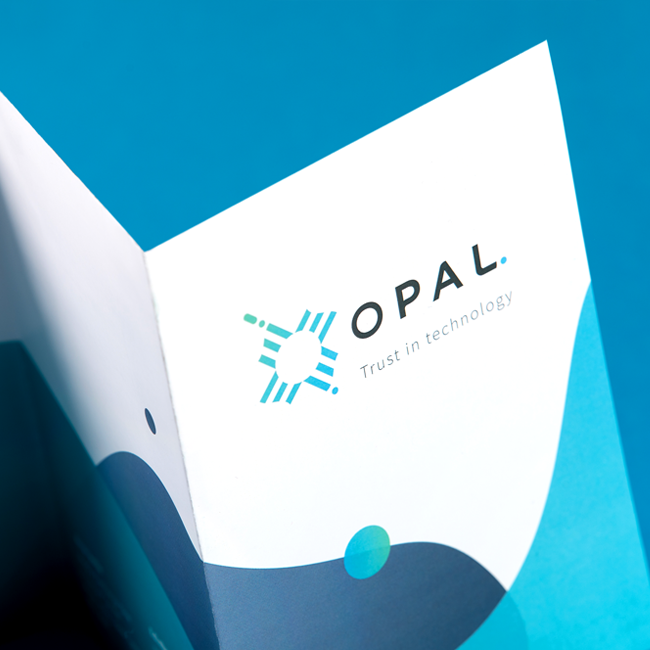
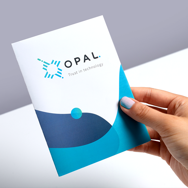
Elements of the previous identity were retained for continuity, with a fresher and more flexible logotype, icon, and colour palette to deliver a clean approach for the brand.

The visual language extended across the illustrative approach and product and service icons, all being built from elements of the main identity. A range of strong colours balanced with neutral hues provided an engaging colour palette, reflective of the major IT operating systems they work with.