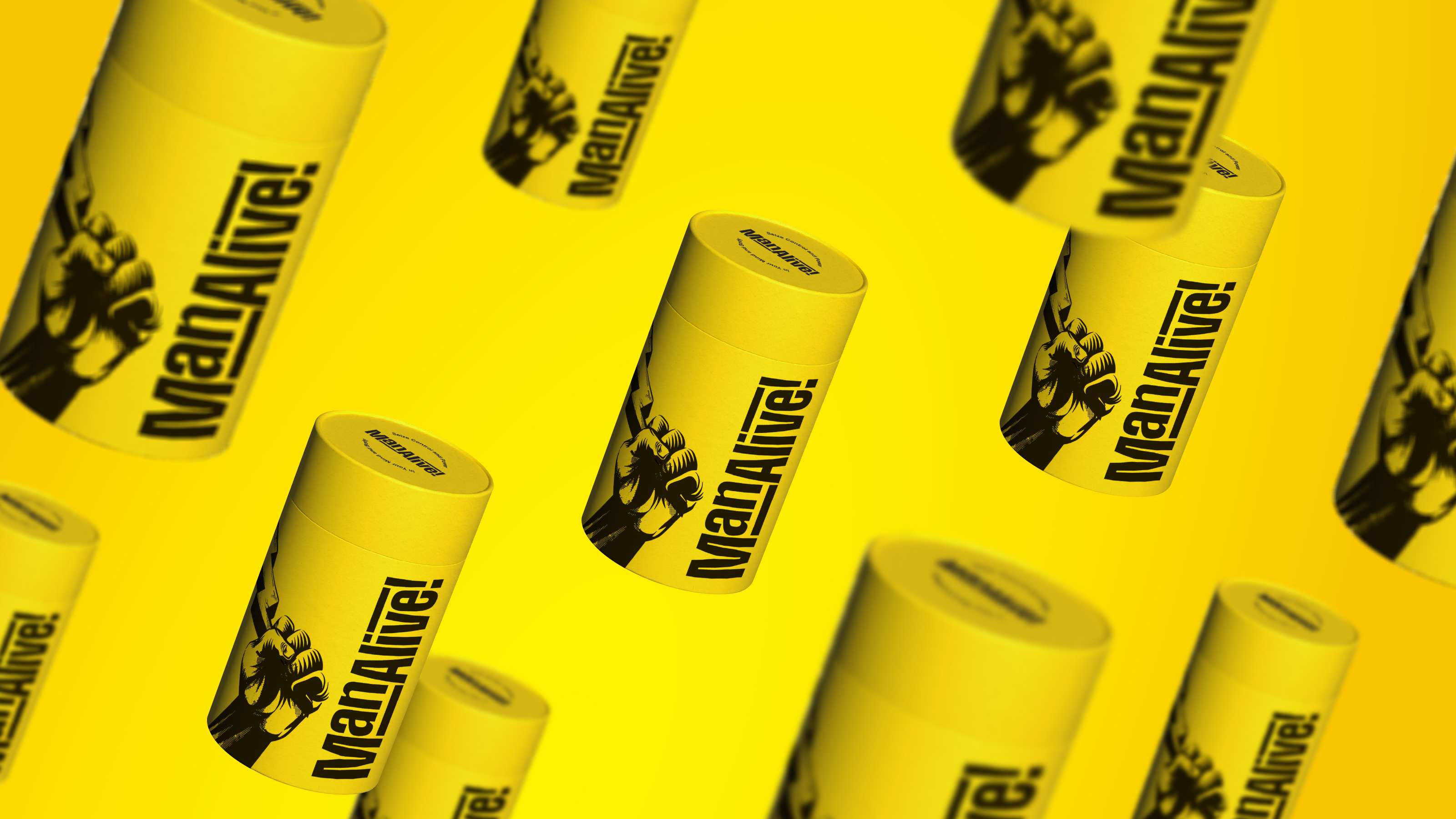
This round of tailored research is going to be around restaurant branding and customer experience. Whilst it limits the industries that I look at for design inspiration, it creates focus and better comparison.
Bar Chido
The first piece of restaurant branding I have chosen is by EightySeven, an award-winning branding studio. They have designed the brand identity for Bar Chido, as well as packaging designs for their very own beer range, merchandise, and the interior design of the restaurant. Bar Chido’s focus is on making incredibly tasty tacos and amazingly refreshing tequila cocktails. They wanted an identity that was fun and energetic that would show their customers that they are in for a good time before they even get through the door.
Their punchy colour palette of pastel colours, contrasted with a bold navy, creates a fun and vibrant brand, the hand-drawn illustrations reflect the craftsmanship behind the cocktails and dishes and the pairing of different, fun typefaces creates a bold, fun and lively identity.
Check out the full project: https://www.madebyeightyseven.com/work/barchido
Costes Restaurant
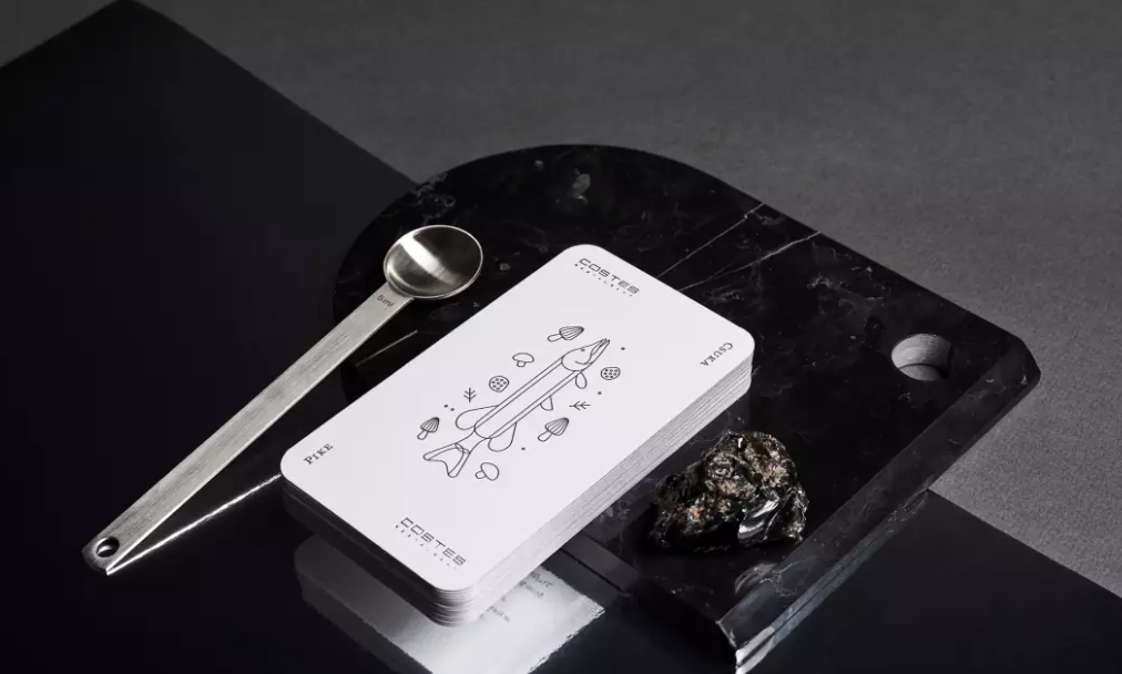
This one is amazing! You must take a look. Absolutely LOVE this 10-year anniversary overhaul of the restaurant’s ordering experience. They have gamified their menus and have introduced a playful experience for the guest when reading their menu.
16 cards, designed to show the ingredients of a dish through graphic line drawings, unfold the whole menu when looking at the full deck. The line drawings are very particular and carefully considered. A lovely navy and white colour palette keep this incredible idea, simple. Costes Restaurant has cared about the details, proven by the hot foiling, edge painting, beautiful art direction, and the special blank joker card which encourages people to write on it and leave feedback.
Amazing idea that would make me want to visit if I was in Budapest.
Experience is everything! Check out the project: https://mindsparklemag.com/design/costes-restaurant-anniversary-game/
HipChips
Ever heard of a chip restaurant? Well, there’s one in our capital! You’ll notice this bold and punchy identity for HIPCHIPS LIMITED, designed by Ragged Edge to stand loud and proud and to grab attention. Hip Chips identity uses a set of bold, headline fonts, almost reflecting a newspaper tabloid-style headline, as well as a bold and graphic set of patterns. Their tone of voice is unapologetic, to the point, and very British. This brings a sense of humour and confidence to the brand. It feels quirky and tasty, and I would definitely make a visit for their chips!
Check it out: https://mindsparklemag.com/design/graphic/hipchips-restaurant-branding/
If you have a restaurant, or any other brand that you think we could help with, please get in touch!